Timeline:
July 8 - Aug. 20, 2024 (6 weeks)
Tools:
Figma, Asana, Google Forms, Zoom
Role:
UX Researcher & Designer
Context:
UX Design Master's Program
Overview
This project redesigns the job post experience to help job seekers evaluate roles faster and with more confidence; without disrupting the workflow hiring managers and recruiters rely on. Using user research and iterative prototyping in Figma, I restructured the information architecture and introduced progressive disclosure to improve scanability, reduce cognitive load, and make key details easier to find. I refined typography, spacing, and visual hierarchy to create a more polished, interactive reading experience, and validated the solution through usability testing and implementation ready annotations to support pixel perfect execution with developers.
Strategy
Competitive Analysis
To identify areas of opportunity by recognizing competitor's strengths and weaknesses
User Interviews
To understand user pain points and motivation.
Opportunity Solution Tree
To find opportunities where user & company goals align; improving user experience
User Flows
To visualize the ideal flow users would experience with new design.
Prototype
Create a working model to validate design through testing
Usability Testing
To validate & gain insight into usability of design from real users
Project Timeline

User Interviews
I created a survey screener to isolate primary mobile users that have currently or recently searched for a job on LinkedIn within the past 6 months. Then, I conducted 6 interviews via Zoom; duration 45-60 mins with the target users. My goal was to understand pain points and to capture the current user experience as a benchmark for testing later.
Key Findings
Job Searching Pain Points:
-
Filling out applications,
-
tracking application status, and
-
ensuring job posts/companies are secure and real.
Primary reason for leaving LinkedIn:
4/6
citing lack of thorough or quality information.
LinkedIn not the primary platform for Job Search:
2/6
citing Linkedin as primary.
* Other platforms mentioned: Indeed, Otta, hiring company's website, Wellfound, OpenDoors, and Glassdoor.
User Experience:
4/6
Users feel disheartened after experiencing negative consequences like scam calls and fake interviews.
Insights

Improving the quality and completion of information in job posts will improve user satisfaction and retention.
Inadequate Job Descriptions
Incorrect Information
Clarifying the job hunting process and how applicants compare can improve understanding and trust.
Poor Job Tracking
High Competition
Unclear User Ranking


Enhancing the validity of companies able to post jobs and therefore the security of user information will improve user trust.
Fake Job Postings
Security Concerns
The job post just feels so busy and each is laid out differently
Jamie L.
I used another site and the job post were so organized I really don't use LinkedIn anymore. It's so inconsistent and cluttered.
Drew C.
The current layout of LinkedIn feels like the information is just dumped there.
Charlie M.
Reframing Pain Points as Opportunities
Mapping them to the OST, I could identify solutions and develop features that enhance the user experience and align with LinkedIn’s desired outcomes.
Now I can clearly visualize a collection of opportunities and desired outcomes to draw from, I decided the biggest impact to the user experience would be
Outcome: Increase in the number of applications submitted compared to job post views
Opportunities: Struggling with efficiently browsing due to lengthy and disorganized job post.
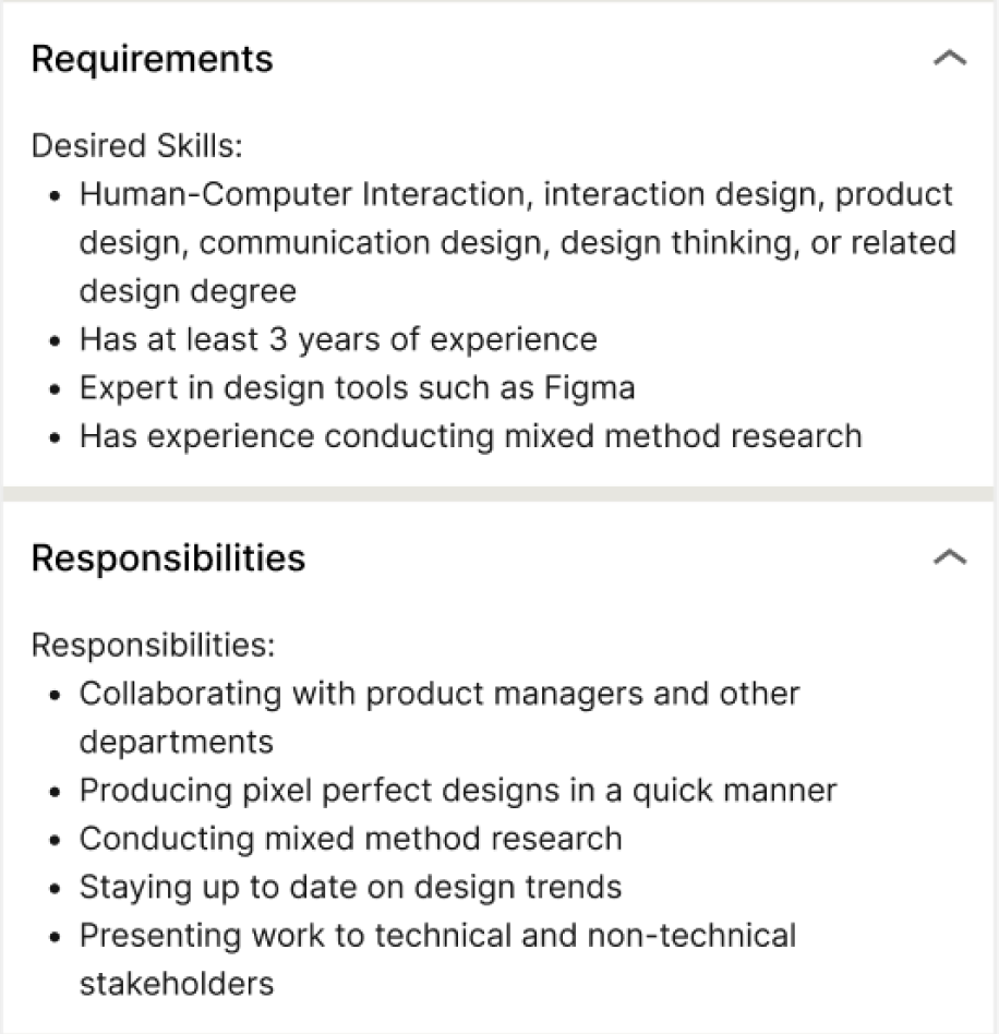
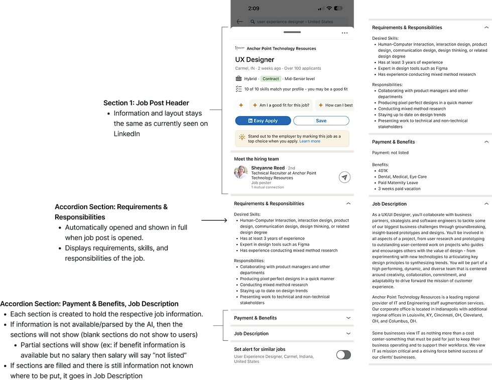
Solutions: Utilize AI to parse job post and create section for everything in an accordion style design
Experiments: Tests to validate if a solution effectively addresses the opportunity (Usability test efficiency of accordion design).

Why It Works
I planned to use progressive disclosure to prevent overwhelming users with too much information at once. This approach will enhances the usability, reduce cognitive load, and improves interface learnabiitiy.
Instead of the information feeling "dumped there", the accordion will only show essential information initially and reveal details only when the user request it.
To stay within scope; I utilized AI to parse job posts details and create defined sections and sorting of the information.The job posters experience remains unchanged, as the AI structures information organization.
Pattern Design
I visited sites that provided a lot of product details and FAQ's to see how other designer handled progressive disclosure. Then, few rounds of crazy 8 to visualize these options working within the current LinkedIn design system.


Problem Statement
LinkedIn’s mission is to help users achieve their career goals and find jobs that match their needs, skill sets, and experience.
I have observed that customers are struggling with browsing for jobs due to disorganized job posts which is causing them to grow frustrated and leave LinkedIn for competitor sites.
My goal is to introduce an accordion style design to job postings so that our customers are can more easily browse the information important to them and increase user retention through higher applicant engagement.
User Flows
I mapped out the steps a user takes to achieve their goal while using the suggested solution. My goal was to avoid adding any extra steps that could cause new frustrations.
Since this is a mobile application, I included the need to touch the screen as a step. In some cases, this reduced the number of steps, especially if the user was familiar with what would be found under each header.

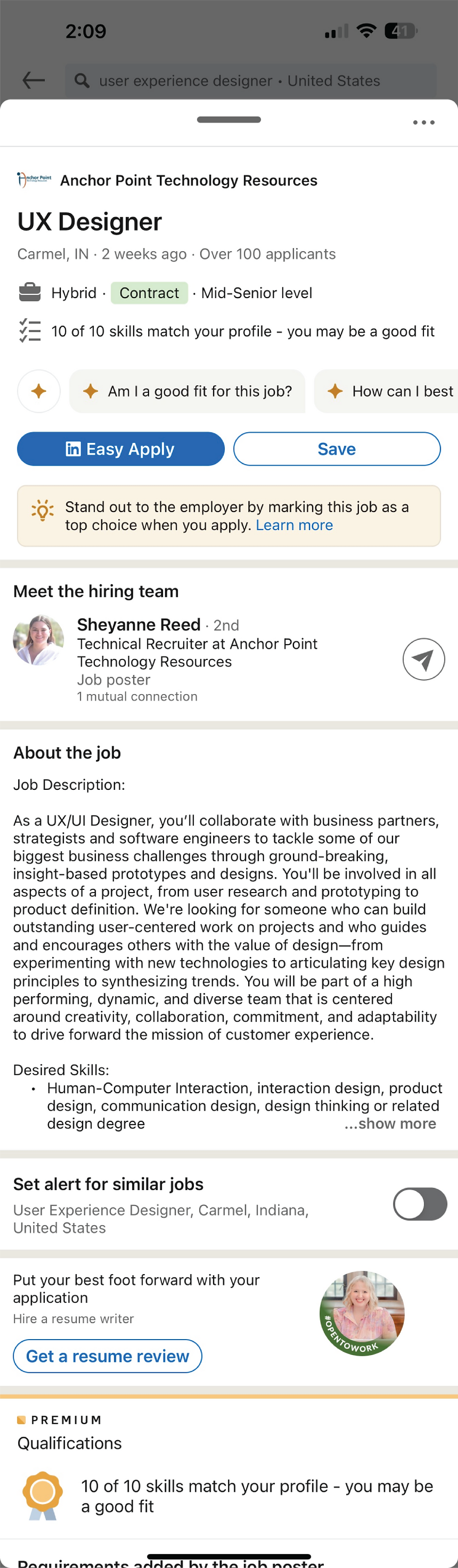
Current Layout
Wireframe Hi-Fi

Prototype

Usability Testing
Time to Test Design
I already composed a pool of participants for testing from the first screener I created, as the criteria did not change.
I conducted 9 usability tests using my Figma prototype via Zoom; each runnings approximately 35 minutes.
Learning Objectives:
User Sentiment on Information Organization
How do users feel about the new organization of information?
Usability of Accordions
How do users feel about the usage of accordions?
Layout and User Experience
Thoughts on the overall feel of the new layout of information, its intuitiveness, discoverability, and impact on cognitive load.
User Sentiment on Information Organization: How do users feel about the new organization of information?
Usability of Accordions: How do users feel about the usage of accordions?
Layout and User Experience: Thoughts on the overall feel of the new layout of information, its intuitiveness, discoverability, and impact on cognitive load.
Results & Impact
Layout and User Experience:
All participants thought the accordion sectioning made it easier to find the information they felt was relevant
"It's nice I don't have to scroll through tons of information. I can go right to what I'm looking for quickly"
All participants thought it was easier to browse the sections than seeing all the information at once
"The current layout of LinkedIn feels like the information is just dumped there. This feels way easier to look through"
Usability of Accordions:
All participants liked the sectioning of information and use of the accordion
"Easy and intuitive"
All users wanted to open multiple accordion sections at once
"I like opening multiple tabs I'm interested in browsing all that information"
User Sentiment on Information Organization:
7/9
Users were unsure what information is within the accordion sections, e.g., Job Description and More Details
"I'm a bit confused about which tabs hold what information. Like, what is the difference between Job Description and More Job Details"
7/9
Users tended to group Requirement & Responsibility and Salary & Benefits information together.
"I'm unsure of the difference between the Requirement and Responsibilities tab before opening them. I always pictured them as the same"
6/9
Users were typically most interested in Requirement, Responsibility, and Salary information (respectively) when trying to decide whether to apply for a job or not.


Design Considerations
Take out company information to focus on improving the layout of the job information
Combine related job information that users tended to group together
Adjusted order of job post information to show in the order most important to users
Allow users to open multiple accordion drop downs at once rather than just one at a time
Prototype

Prototype Iteration
